Franko Small Engines is a lawn mower shop in Granite City, Illinois that may or may not be owned by a family member of a certain Gorilla 76 team member.
These guys sell heavy-duty lawn-care equipment, both to the average Joe as well as landscapers and lawn-care service providers. Our job was to represent the brand they’ve been building since 1959 with a logo, tagline and small website focused on helping them get more people through the doors.
Getting started
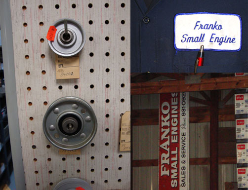
We started the job by heading over to the shop, exploring, talking extensively with the owner, Kevin, about the company’s history, customer base, challenges as a business owner and goals. Visual inspiration for the design came not only from all the shiny new mowers, but from the old peg boards that covered the walls, the old-school paper “for sale” tags, Kevin’s uniform, old signage, family photos and a finger on Kevin’s right hand that seemed fitting for a guy who’s been repairing lawn mowers his whole life.

After the visit, we had a pretty solid idea for where we wanted to take the brand. It was to be about tradition and the local customer base that Kevin and his family had built through the years because of great service and relationships.
Rolling back the sleeves
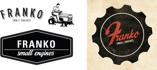
We explored several clean, retro-feeling typestyles and graphic ideas for the logo before finally landing on the colored one represented below.

The gear container for the type was meant to hint at the mechanics of what they do and the typeface was intended to bring out the classic, down-to-earth characteristics that really define their business. The final tagline: Family owned. Lawn trusted. Since 1959. hammered that tradition home as well.
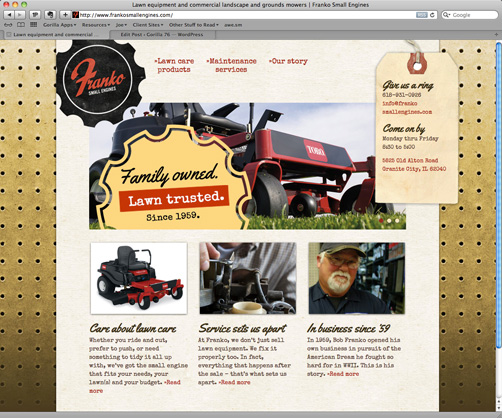
Jumping into the website, we made use of the visual assets we collected at our visit to the shop for textures, background images, etc. We had access to Toro’s dealer library of images as well, which we made use of to represent some of their products. The copy was intended to have personality but still be informative. We represented the types of products they sell, the maintenance services offered and the history of their shop. The primary calls-to-action hang down the right side of the layout regardless of the page you’re viewing making it a customer friendly site.
It was a small project but a lot of fun, and one that we’re certainly proud to put our name on…
