For many businesses, the website is often the first introduction for customers and clients. Across all markets, a company’s website is where people end up through search results in their quest to research and learn more about services and products.
The same holds true for the industrial industry. Building a website for businesses in the industrial industry is a different challenge compared to more customer facing websites. From dense information and business goals to creative graphics, typography and color schemes, there are many design elements to consider.
A greater importance is being put on readability and usability over aesthetics. Not long ago, agencies were designing and developing websites with wild navigation systems. These hi-tech appearances have started to fall away for more minimal, cleaner layouts. Companies and website visitors alike are more concerned with every page working properly and ensuring it’s easy to use.
Our designers are regularly looking for industrial web design inspiration. We’ve put together a combination of important design factors we consider for Gorilla-built websites along with inspirational sites from companies doing design right. These websites have been inspirational for our own designs.
Dense information
What makes industrial website design a different challenge than more customer facing websites is the technical aspect. There is usually a lot of dense information that we have to figure out a way to make more easily digestible. Even within the industrial sector, design is a challenge from business to business. We design sites for businesses specializing in construction, bioplastic manufacturing, dairy production and commercial flooring installation among many others. Each one is completely different, loaded with extensive amounts of information that needs to be conveyed to potential customers.
The challenge is becoming an expert, having a sound understanding of what they do and conveying that through the websites design and content.
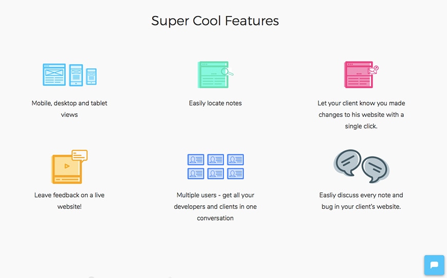
One of the sites we use for industrial web design inspiration is Webscope. We’ve been impressed with the information Webscope conveys through its design. The company created a communication platform for web developers and clients. Webscope’s message may be simple, but conveying a clear understanding of what the app is, its abilities and why it’s beneficial could easily be muddled and bogged down with expansive content. Their site takes an efficient and effective route to clearly and concisely communicate with visitors.
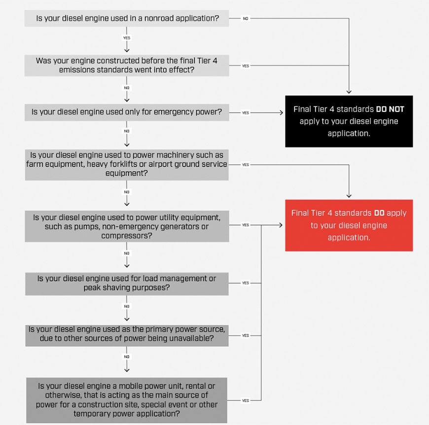
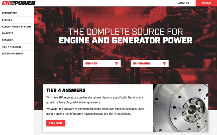
We took a similar approach when designing for CK Power. We created a graphic to help explain complex Tier 4 engine regulations. This flow chart has been very popular with their audience. It’s been a helpful way to lead potential customers through complex information. The EPA’s Tier 4 information is complicated and dense, consisting of thousands of words. The flow chart our designers created condenses it down and gives credence to CK Power as a thought leader.
Business goals
All design decisions are based off business goals set up prior to designing the website. Every element of the website has a business goal tied to it. Some websites look cool just to look cool, but for our clients, everything serves purpose. To help with the determination of the business goals and how they fit into the design, our designers wireframe the websites we create.
When wireframing, we’re thinking about the buyer personas. How is this buyer persona going to navigate the website? How can we make it easiest to find things? One of the main goals is to drive conversions.
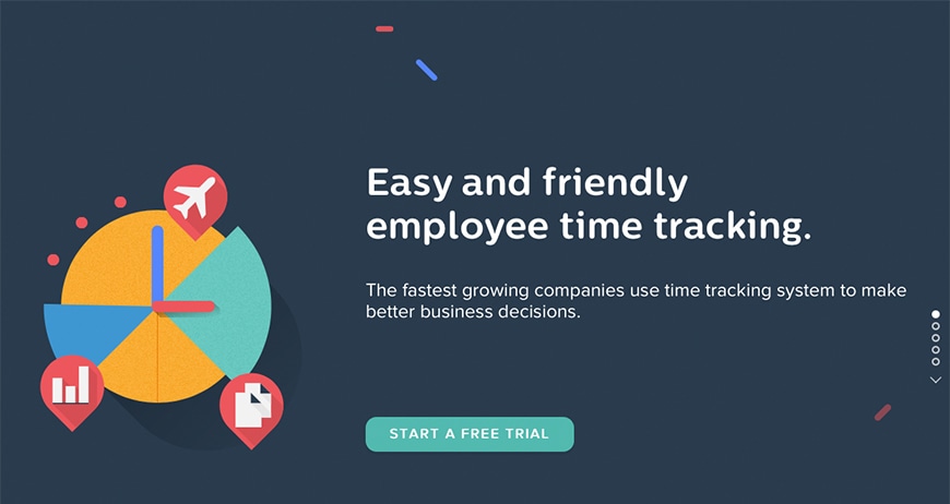
Timepot, an employee hours tracking site, is a great example of a website with clean, efficient design with the clear goal of driving visitors into conversions. The option to start a free trial is heavily featured without being negatively aggressive. Eyes aren’t bogged down by hard-to-understand visuals, the navigation is simple and every element has the clear goal of encouraging visitors to convert. A few minutes on the Timepot website will show why it has provided us with plenty of industrial web design inspiration.
When we designed the site for Spectra Contract Flooring, leading visitors to the case studies pages was a prominent business goal. With the case studies page being a major priority, we gave it a featured spot on the main navigation in addition to visual call outs on the homepage.

Visuals: graphics, color theory, typography
One of the overall business goals to keep in mind is to make a website visually compelling to keep visitors on the site and engaged with its content. Often, the first impression is the lasting impression. Potential clients will come across your homepage and within 10 seconds, make a decision whether to stay or leave. Visuals that reflect the values of the company, the services performed and the products produced can affect people on a subconscious level. From treatment of visuals and color theory to typography, these elements make up the aesthetics of the site, affecting visitors’ actions.
Designers can learn how to use color appropriately in school, but sometimes you have to take the creative freedom and use what you’ve learned through experience. The rules aren’t hard and fast. That applies to typography as well, you can learn the basics such as line length and font, what to use for headlines and body copy, but experience and creative freedom comes into making design decisions.
Additional visuals include graphics and photos. Sometimes, a company selling a product or selling a service will include photography or visual aids. Having high quality photos is important. Images, illustrations and visuals often capture someone’s attention quicker than text.
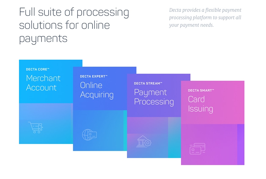
One of our favorite websites for visuals is from Decta, a provider of online payment services and e-commerce solutions. Decta provided industrial web design inspiration through their site’s use of typography, color theory and visual elements. These elements play an important role conveying comfort and expertise as a thought leader in e-commerce. The color scheme is filled with soft, blended tones while the font is to the point, using simple lines without flair.
Returning to CK Power, we chose the site’s font for the sharp angles, along with a thick and tough appearance similar to an engine. The color scheme is bold, emphasizing the fonts and matching the qualities of their engines. CK Power’s website commands the screen with assertiveness, but never crosses the threshold to aggressive.
Before jumping into a costly website build, make sure you are asking the right questions, placing an importance on effective design and looking to other successful sites for plenty of inspiration.
Want to learn more about our B2B website design? Read about how we develop and design websites as an integral role in your businesses toolbox.

