
This is the final installment in a four-part series on brand voice in the written word, audio, video and design.
In our first series edition, we focused on developing and implementing brand voice in the literary, written sense. Our second edition considered how to promote the actual voices of your team members to further strengthen brand messaging. Then we analyzed how to instill that voice in your video style.
Now, let’s instill your brand voice in web design and other promotional materials.
Before we look at the big picture, let’s start with basic elements like color and fonts. Then we’ll move into elements like special icons, graphic design and artistic layouts.
Above all, consistency is your priority. It can be difficult to achieve on a company-wide level. But once you get it right, the benefits build upon themselves.
“The more people see it, the more effective it will be,” said Randall Zaitz, G76 thinker & digital creative director. “It’ll make this immediate connection in their head without them even really thinking about it.”
Design style starting points
You must create, share and enforce brand design guidelines to achieve consistency.
Brand guidelines should include company colors, fonts, graphics and other defining characteristics.
These rules are especially critical to outsourcing design work to a third party. Customers should see your page and know it’s yours right away, no matter who built it.
First, dictate your brand’s colors and fonts.
They may seem like simple decisions. But when done right, color and font selection pay dividends for years to come.
Company color palette
A consistent hue is an evergreen PR campaign.
John Deere Green, Caterpillar Yellow, UPS Brown.
Customers around the world know them when they see them. They bring to mind how these companies impact their lives. These colors represent services, values and histories.
Randall recommends limiting your brand colors to three. Too many colors will add visual noise and make it more difficult to maintain consistency.
Choose a primary brand color to feature in your logo and layouts. Then pick two or three complementary colors to fill out your design. Randall favors a simple yet versatile palette.
Set guidelines for how much of each color should appear on the page. For example, set your primary color to make up 70% of the color on every page. Or reserve the primary color for highlights that pop.
Color psychology
People associate colors with emotions and attitudes. But these associations aren’t consistent across cultures and industries.
Consider what a color means to your target audience.
“Broad generalizations about which emotions that colors invoke aren’t universal,” Randall said. “Blue isn’t always sad, and red isn’t always angry.”
Many Americans think of red as the color of rage and war, while some Japanese traditions understand it to mean joy and celebration.
Then there are brands that redefined what their colors represent in popular culture.
John Deere’s farming brand works well with green, the color of many plants. But they’ve done a lot with this exact hue since the company’s inception. Today, that shade of green means one thing to people on every continent.
Boo to business blue
Avoid shades of blue that are all too common across B2B companies.
Industry wisdom indicates that blue is the safest, most reliable color you can pick. Perhaps that’s why you shouldn’t.
“Blue is unoffensive,” Randall said. “People associate it with corporations because so many of them have blue as their color. It doesn’t stand out. You probably shouldn’t make blue your brand color, because literally everyone else is.”
Make a statement in your space with a unique color like purple. It’s pleasant and versatile, evoking authority as well as tranquility.
Brand fonts
Legibility is a font’s most important quality. Don’t get carried away with the ornate.
You need no more than two fonts across all your company messaging materials.
Select one for your headlines and another for body copy.
“You’re going to want to pick a font that is reflective of the tone and voice that you’ve developed,” Randall said. “If your voice is tough but fun, you would want to pair two fonts that match those characteristics. Or find a font that marries those two things together.”
If you’re willing to invest in distinction, hire a digital foundry to develop a font that’s completely your own.
Otherwise, you can find free or reasonably priced fonts that fit your brand. Google Fonts is a good resource for free options, and Adobe Fonts has premade selections that won’t break the bank.
Common fonts have their benefits. A well-known font like Helvetica — the font used on street signs —offers a sense of familiarity. That can come in handy for a new player on the market.
But you’ll need to distinguish yourself by using it in a way that is completely yours. If you don’t, your brand won’t stand out from the rest of the market.
Geometric vs. humanist fonts
Start by deciding between geometric and humanist fonts.
Geometric fonts contain perfect circles and squares, reflecting precision and professionalism. Their ranks include Gotham and Avenir.
“Geometric fonts generally look a little tougher,” Randall said. “They have sharp corners and tight, even proportions. They always look really balanced, but they kind of lack some of that familiar handwritten flair. It makes them harder to read in body copy.”
Gorilla 76 uses a common geometric font that fits our crisp style. It’s called Source Sans Pro. You see it on a lot of websites. But our bold colors, shapes and illustrations maintain a distinct appearance.
Humanist fonts carry the weight of history. These old-style fonts are inspired by calligraphy and pen strokes. Among them are Tahoma, Verdana and Calibri.
Humanist fonts often come with their own personality and character. They’re familiar, traditional appearance also makes them easily legible.
If you go this route, Randall recommends choosing a big, bold font for headlines, then using a lighter humanist font to make the body copy stand out.
Graphic design and layouts
Now that you’ve chosen colors and fonts, it’s time to put a high-conversion page together.
As always, ease of use is your priority. Don’t let your style hinder readability and navigability.
“Simple is better,” Randall said. “Don’t make your visitor think too much. The content is the hero of the page, not the design.”
Randall recommends segmenting your layout into bite-size chunks. This allows visitors to quickly scan a page and determine if they’re in the right place. Layouts with a lot of dense text often cause readers to tune out before they pick up on your voice in the content.
Every style choice should have a purpose, especially your images. They should reinforce the written content and brand voice.
Never fill space with cheesy stock imagery that loosely relates to your company. Show your real team members at work, helping customers, doing what they love.
“Images for the sake of having images just eats up precious bandwidth (your site speed) and space (it blocks the actual content),” Randall said. “Always have a why behind each design decision. Why did you use that color in that specific way? Why is that graphic element there? Why that specific photograph?”
Gorilla 76 has worked with several B2B companies to refresh their webpage design.
Let’s look at two of Randall’s favorites.
The Korte Company
The Korte Company maintains a consistent style throughout its web and print materials.

In previous installments, we personified this brand style as “The Korte Man”.
He represents the construction company’s valued qualities — grit, skill and intellect.
Customers see the best parts of themselves in The Korte Man. If they can’t be him, they want to work with him.
“The Korte Man is a tough guy who knows how to do technical things,” Randall said. “He’s like Neil Armstrong. He’s the star quarterback who can program a computer.”
Randall used minimalistic yet refined web design elements to reflect this brand character.
He took business blue and made it into a dark, desaturated midnight hue. This contrasts well with a bright construction site yellow for the highlights.
“The yellow can represent a site map, caution tape or even the reflective stripes on safety vests,” Randall said. “When you’re making design decisions, even if it’s really subtle, there should be meaning behind it. People pick up on that.”
Yellow represents the company’s humble roots as a small construction contractor. The deep blue represents its growth into a major Design-Build company with a depth of expertise.
Randall used the bright yellow to outline The Korte Company’s heavy headlines and break up the dark space. This contrast enhances the sense of depth, making it feel like the highlights hover over the page.
CK Power
G76 won an award for CK Power’s web design by making a little color have a big impact.
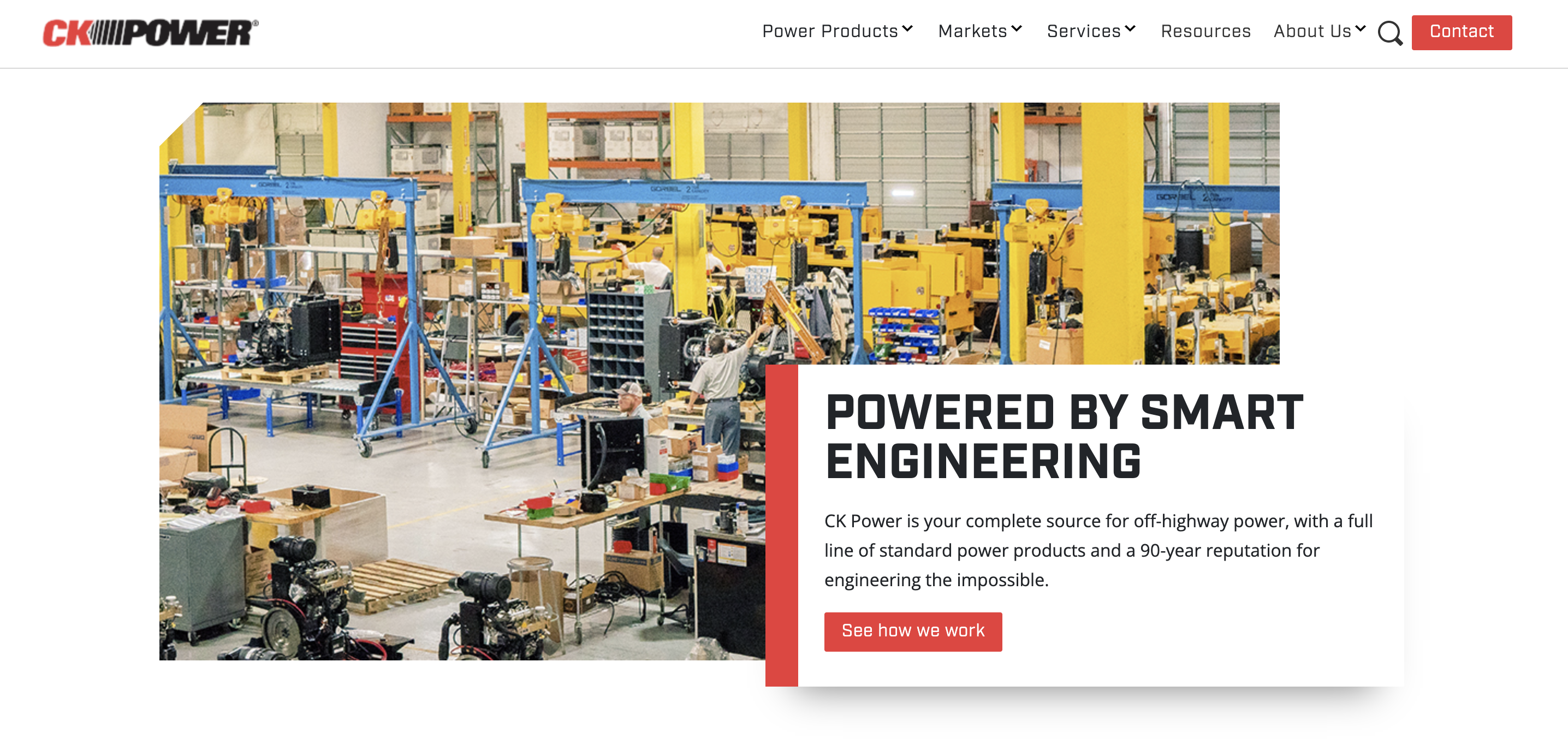
When we came aboard, the company color palette was generic red, white and black. This scheme is the second most common after business blue hues. But it’s still effective if used with discretion.
CK Power was using heavy-handed colors and very little white space. The bold scheme matched the generator manufacturer’s tough and ready company culture. But these are electrical engineers, not cowboys. They needed something to bring in that hard science element.
Randall repurposed the red and black to represent positive and negative battery terminals. That’s something generator customers could relate to.
“Those are the colors that you’re going to see a lot in electrical diagrams,” Randall said.
Randall removed, reshaped and repositioned the color, adding white space until he shaped the site into something familiar and visually appealing.
“That made the red pop,” he said. “It takes on more meaning when you use it sparingly. Color is kind of like the seasoning in cooking. It’s very easy to overseason a dish.”
Ready to give your brand a voice?
This is the end of our four-part series on implementing brand voice throughout your marketing materials and company messaging. We hope it’s helped spark new ideas to enhance your outreach strategies.
Could you still use some vocal training?
Reach out to Gorilla 76 for guidance. We’ll work together to establish a consistent brand voice and build a connection with customers.
It’ll pay off for years to come.

